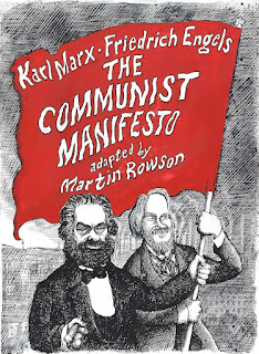
I learned of Martin Rowson's graphic interpretation of The Communist Manifesto a few years ago, but I only just have had a chance to read it. Separate from the actual message of the text, I was mostly curious how the text would even translate into a graphic novel format. It's a treatise on what Karl Marx and Friedrich Engels thought communism means as political/class struggle, and not the type of book that lends itself to obvious visuals obviously. So what would Rowson do with it?
Rowson leaves
Marx's original text
largely intact. I didn't do a line-for-line comparison, but it seems to be basically be just a slightly abridged version. I don't know if Rowson himself trimmed things down or if he used someone else's edits; I suspect the former since the original Manifesto isn't all that long in the first place. The one big "edit" to the text is the third section in which Marx discusses a variety of other socialist movements in order to point out the differences between them and communism; Rowson here, though, eliminates the text entirely and tries to represent each exclusively through visuals. (More on those in a bit.) Rowson also adds an almost completely wordless "Aftermath" section after Marx's text to show how the work has held up over the past century and a half.
So if the text is just lifted from the original, how does that work in a graphic novel format? Well, like many non-fiction works that are adapted to comics, the basic framework is that of Marx himself speaking the text to the reader with Engels silently following along. (As Rowson notes in his foreword, while the text is effectively Marx's own, many of the ideas came from extended discussions with Engels and the ideas behind the text are from the both of them. Hence, Engels constant but silent appearance throughout.) Where Rowson diverges from cartoonists who just try to illustrate the original author speaking, however, is what he has going on in the background. I've read many of these types of books where the backgrounds are effectively non-existent, just a block of color to differentiate one panel from the next. Rowson, by contrast, has Marx walking through often-double-page-spreads showcasing the dystopian metaphoric world Marx was living in and reacting to.
And the metaphor Rowson uses? A giant clockwork robot labeled "Capital Power" that snatches up people, grinds them into bits, and ejects the remains under steamrollers to further mash them all into a giant paste which eventually covers all the land. Rowson's artistic style here, fortunately, is rather cartoony so despite being fairly explicit in many places, it doesn't come across as excessively graphic or gross. The ideas are unsettling and the mostly dark grey color palette spotted with tinges of red offer a very oppressive, nightmarish feel but the actual illustrations aren't any more upsetting that any given issue of Mad Magazine.
The second section shifts a bit as Marx discusses the actual ideas behind communism. Cleaner linework without "dirty" ink washes over everything. Rowson also takes advantage of Marx's own somewhat rhetorical prompts to bring in a more direct back-and-forth with his audience, portrayed here as the crowd at a club's open mic night. The third section, as mentioned earlier, is just the visual expression of how Marx viewed other forms of socialism as the characters of Marx and Engels desecrate statues in various ways. The final section of Marx's work returns the clean linework, and has Marx and Engels launching their final attack, which closely mimics the final scene from Butch Cassidy and the Sundance Kid.
The Aftermath, also as noted, offers a statue of Marx and Engels in their final pose and how it falls into disrepair over time. Only to see the environment around it also collapse into a modern version of the dystopia seen at the begininning of the book, ending with an echo of Marx's opening statement.
The text is the text. If you're upset or offended or whatever by Marx's original, well... it's literally the same words here. I don't think you're going to be any more or less swayed into communism here than if you'd just read the original Manifesto. Rowson, I think, does do an excellent job of re-presenting the text in a manner that's perhaps more contextually insightful, well over a century after the first publication where few people today have a good sense of what life looked like for most people in 1848. Does that context change the presentation of the ideas in any meaningful way? I'm sure it does at some level, but I also think so many people have pre-established ideas about Marx and communism in general -- whether they've previously read The Communist Manifesto or not -- that those will outweigh whatever influences Rowson's graphics carry. Regardless, it does a much more successful job at providing graphics to a non-fiction work like this, and I think many other creators could learn a thing or two about making graphic adaptations from studying this.
The book was published in 2018 by Self Made Hero, so it should be available through most bookstores even if they don't have a copy on hand. It's got a retail price of $19.99 US and worth checking out for the graphics regardless of your political leanings.
Communist Manifesto Review
By Sean Kleefeld | Thursday, November 09, 2023
Leave a Comment


0 comments:
Post a Comment