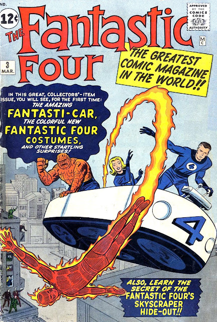
The cover to Fantastic Four #3 is a pretty iconic image for FF fans. It's the first look at the team's costumes and the flying bathtub. Plus, it's a pretty clear depiction of the whole team, with no cover blurbs blocking parts of characters or villains getting in the way, and with all the team members given nearly equal visual weight. There aren't many Jack Kirby covers that do all that. FF #59 kind of works, but the characters are all separate and don't really look like a single group.
Now, you all know me as a Kirby fan, but I have to say that this cover really just bugs the heck out of me. I've never liked it. Why? Because it's wrong.
Not in some weird design sense, or as some sort of artistic judgement I'm making, but it's just plain anatomically wrong. Look at the Human Torch's right hand. His palm is stretched up towards his head (down relative to the cover itself) but his thumb is positioned to the front of his body. Try it with your own hand. Right hand, palm up. Where's your thumb? Pointing back behind you.
Here, let me flip the image so the Torch appears right-side up, and zoom in on things so you get a better perspective...
Looks like about the most unnatural thing in the world, now, doesn't it?
As much as I love Kirby's work, I wouldn't at all mind seeing this image corrected for any promotional purposes. Keep the original for reprints -- make it a true representation of what the original was -- but correct it for the t-shirts and coffee mugs and vinyl wall stickers are such, please. Here, let me give you everyone a head-start...
The Fantastic Four #3 Cover Error
By Sean Kleefeld | Thursday, June 02, 2022
Leave a Comment


0 comments:
Post a Comment