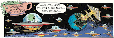
The 12th's comic uses Deering's loose style but the linework and coloring is very clean. Everything has a clear demarcation between marks. The comic from the 22nd still has very clean colors, but the linework is rougher, particularly in the shading. Some of the lines fade in and out as you would expect to see if you quickly drag a pen across the page. Then on the 28th, the linework seems a bit cleaner but the coloring is rougher and more muted. Almost muddy in places, and at the very edges of the image, just outside comic's borders, you can see the not-quite-white of what's presumably the paper the comic was drawn on.
My initial guess, and what seems most obvious, is that Deering switched from drawing digitally to drawing using traditional pens on September 22, but he spent a week scanning his lineart in, cleaning it up and coloring it digitally before realizing that it'd go quicker (or, potentially, just that it would look better or go smoother for him) if he colored it by hand and did minimal, if any, clean-up work after he scanned it. I know there are digital brushes that do a good job of mimicking paper textures and pen pressure changes and the like, but given that last image that suggests we're looking at the paper Deering is drawing on, I'm inclined to think he switched to all traditional methods and is not going the extra mile to make an all-digital creation look like it was made traditionally.
I can't find anywhere that Deering has spoken to this publicly, and the commenters on GoComics.com didn't even seem to notice. I can't find any acknowledgement of the change, at any rate.
But then it occurred to me that this would reproduce pretty horribly in print. The colors are a little muddy to begin with, and many papers still print their daily funnies pages in black and white which would make it look even worse. But then, interestingly, you can actually see a shift in Deering's Sunday strips. Even a strip like this one from a few weeks ago...
Which suggests to me that Deering is continuing to color his Sunday strips digitally so the color can be either stripped out or printed more cleanly, depending on the dictates of whichever newspaper these are getting sent to, but he can "get away" with coloring his daily strips by hand because it isn't being syndicated anywhere. I think you'll find the only place to read Strange Brew daily is on GoComics' website. I'm pretty sure it used to be in newspapers during the week, but I can't say how/when it fell out of favor there. My first thought on why Deering changed in 2020 was somehow pandemic related -- maybe his tablet broke and supply chain issues meant he couldn't get a new one quickly -- but I wonder if the change had more to do with his receiving notification that his dailies were not being sent to any physical papers any longer.
Regardless, it does make for an interesting reminder some artistic choices that you see made come from the dictates of the industry and aren't really artistic "choices" the creator themselves had any real control over.


2 comments:
I noticed it when it happened.
https://www.dailycartoonist.com/index.php/2020/10/26/notes-on-some-syndicated-comics/
Any chance you heard Deering's reasoning for the change, or heard him comment on it at all?
Post a Comment