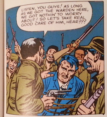
My thought for today's post was going to be presenting the first Black character shown in what's now known as the Marvel Universe. Basically, I wanted to see how early Black people were integrated into Marvel's comics after Fantastic Four #1. Not necessarily a named character like Robbie Robertson or Black Panther, but just any random background character with darker skin.
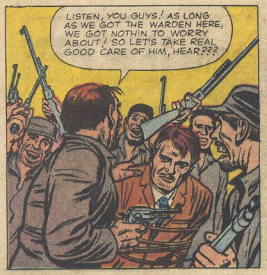
So I pulled out my Marvel Masterworks and started flipping through, and came across this gent in Fantastic Four #8. He's a prison inmate trying to escape, but it'd be somebody.As I started going through some other back issues -- namely The Hulk #1-4 which I don't have in the Masterworks format -- the thought occurred to me that the FF issue was actually a reprint and might not faithfully depict the original colors. So I dug up a copy of FF #8 and, lo and behold...Besides no one of color being depicted here, you can see that almost none of the original color choices were used.
But, now here's the really interesting bit: check out the colored version that's available through comiXology today...Brighter and more vibrant, but essentially the same colors as the original.
It's no surprise that these older comics would need to be recolored for today. The original separations, I'm sure, were treated more disposably than the original art. But it would appear that, in their initial high-quality presentation of the material, someone at Marvel opted to make the comics more inclusive than they really were. That's more than the stylistic choice of a blue background versus a yellow one, that was a deliberate choice where somebody said, "Hey, we should be more race conscious -- make one of those guys Black."
On the one hand, I can appreciate that they were trying to be more inclusive in 1987 when the Masterworks book first came out. As minimal an effort as this was. But what that also does is change the historical record so that it misrepresents where Marvel was at socially in 1962. It makes the company look more progressive than it was. The truth is, as of FF #8, Marvel was not thinking about equal rights or showing people that didn't look like anyone in their offices.
A lot of these little seemingly minor changes can really skew how people perceive and understand the world around them. For years, I was told that Rosa Parks didn't give up her seat because she was tired. She was indeed tired, but not physically. She was tired of being treated like a second class citizen and was fairly active in the civil rights movement. That seemingly minor change of phrasing puts a whole different spin on her actions -- it was no longer an weary act of exhaustion, but a deliberate motivated act of challenging the status quo.
But does this single panel in a single comic (well, technically two panels; a Black guy shows up in one other in the Masterworks book) equate at any level with Parks refusing to give up her seat? Of course not. The significance of this one comic pales in comparison. But with enough little changes like that, and you can present an entirely different Marvel than what actually existed. In fact, that's precisely why so many people criticize Stan Lee -- he's presented a skewed version of what happened in so many ways that it's culminated in a sort of cult of personality based around a character of himself that doesn't actually exist. Which, in turn, is why he's so often given sole credit for creating Spider-Man or the X-Men or the Fantastic Four. And that credit is money. With the movies doing as well as they've been, that's a LOT of money.
Does the alteration of a background character's skin color have that kind of impact? Probably not. But it's still a distortion of the record. "Was colorist Stan Goldberg really that progressive?" "Was Lee really pushing for more diversity that early?"
I'm glad that the comiXology version seems to be more in line with the original coloring. Kudos to whoever made that decision. But in this Golden Age of Reprints, keep in mind that you're seeing a reproduction of history which may have been distorted to make someone look different than they really were/are.
On -isms: Reprint Black-washing?
By Sean Kleefeld | Thursday, February 26, 2015
2 comments


2 comments:
Sean,
The first incidental or background characters who were African-American that I've discovered at Marvel circa the early 60s were drawn by Steve Ditko. Amazing Spider-Man #22 (cover dated March 1965; on the stands in December 1964) includes a student in Pete's class on page 4. It also looks to my eye that Ditko meant a police office in that issue to be African-American but was caucasian colored.
Often in later issues Ditko added lines on character faces to differentiate and point out to colorist Stan Goldberg that this character was black. In almost every issue going forward Ditko included pedestrians, students, doctors, police officers and employees in Jameson's office in the strip (and Dr. Strange).
An African-American who had a bigger (albeit one shot) role appeared one month before Ditko's story, in Tales of Suspense #61 (Jan 1965 cover date). In the Kirby drawn Captain America story Cap rescues a pilot in Viet Nam. He also appears in the cover.
It's possible that Kirby and others may have drawn black characters early on but the colorist wasn't alerted and colored them caucasian. Taking a look at the features of the man in The FF panel you reproduced it is possible Kirby originally drew him to be African-American.
Great research work, Nick! I'm not surprised that it would be Ditko who pushed the issue forward earlier than most artists. Thanks very much for the info!
Post a Comment