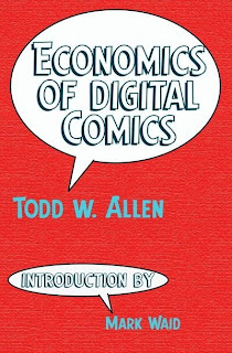
Todd W. Allen has been working on Economics of Digital Comics for over a decade, first working on it as his Master's Thesis at NYU. The previous edition of the book came out in 2007, and Allen ran a successful Kickstarter last year to bring a new, updated and revised edition to print. As a big proponent of web and digital comics, I was eager to see what Allen had to say.
The greatest strength of the book, I think, is the research Allen's put into it. Many people are really cagey when it comes to discussing their finances, so things like cost structures, pricing, revenues, etc. are mostly a big enigma that every creator/publisher has to try for themselves, largely on a trial and error basis. Obviously, this is dangerous way to run a business, especially for those that are run by the comic creators themselves who often are only handling the business end of things because they have to -- they'd rather just make comics all day and let somebody else worry about the money part.
Allen's research is composed of three parts. First, he's culled together a huge number of individiual and independent quotes taken from existing interviews and posts. Compiling them all together, he's able to see where pieces dovetail off and/or corroborate with one another. Second, he was able to talk to a number of comics people -- some on the record, some off -- and they were able to answer some of his direct questions about the economics of publishing. Third, he took what data points he was able to collect from the above, and then went to a variety of vendors asking for quotes. Taking all three approaches together, he's able to put together a reasonably complete economic picture of the digital comics landscape.
(He talks about webcomics as well, but the focus is very much digital comics.)
The prose is serviceable, but it gets a little repetitive in places where he's discussing multiple options under slightly different conditions. Coupled with the book being relatively numbers-heavy, this might be a little off-putting to some people. There's a huge wealth of information there, and it's worth working through even some of the drier bits for some really great insights.
But I have to say that I was pretty regularly distracted by some really bad layout and design decisions, starting with the cover. (Blue text on a red background? As bad as it looks on screen, I can't tell you how much it vibrates in person!) The interiors look like he wrote the whole thing in Word and just exported that in whatever page flow came out. Chapters often start on even-numbered pages, there are widows and orphans all over the place, sub-headers sometimes show up as the last line on a page, footers butt right up against and occassionally even overlap the main body copy... The charts are all treated differntly, using a variety of fonts and styles; some appear to have switched axes; one even runs off the page entirely. I could let pass some of the editing mishaps, like the font accidentally changing color mid-sentence a few times or some paranthesis left over from before he switched to footnotes, but coupled with the almost complete lack of design, I found myself getting distracted from the content of the text every few pages.
Which is a shame, because there is some really good content here. And the people who probably need to read it the most are the artists and designers who would also be distracted by bad design. I might go so far as to suggest waiting for the next edition, but between the lag time between them and a review of the 2007 edition where the bad design was also cited as a concern, you're not going to gain anything by waiting. Check it out now while all the data is still current. Economics of Digital Comics is available for purchase through Amazon for a list price of $19.99.
On Business: Economics of Digital Comics Review
By Sean Kleefeld | Monday, February 02, 2015
3 comments


3 comments:
And a pretty high list price for less than 200 pages. Phew. Ugly design, high list price, Kindle version as costly as a paperback in a bookstore...this does not bode well for his economics.
Ha, good call. This sounds painful.
It's really a shame that potentially good books are still smeared with awful design.
That said, I must sympathize a little. A lot of this sounds like the kind of thing that there just is no simple way to automate; complex information still requires careful, bespoke tailoring to look professional. This can really add up, presuming that you're paying a rate necessary for the caliber of designer to make the exercise worthwhile. I'm fortunate because I can design my own books.
Clearly this is some kind of commons problem, and we need large federal grants available to help pay designers whose important services are being skipped. ;-)
The killer for me was about half-way through the book, he had a widow after a page turn. Plus it was the last sentence before a new subheading so there was all this extra space immediately afterwards. But not only that, it wasn't even a whole word. Just the "ly" from the tail end of a hyphenated adverb. Two lonely letters just hanging out underneath the page number. I had to flip the pages back and forth several times because I couldn't believe what I was seeing!
I'm not even counting against him some of the design decisions that I just didn't agree with like paragraph indentations that I felt were too deep.
Post a Comment