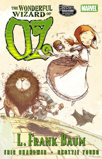
 Marvel's latest version of The Wonderful Wizard of Oz was published as trade paperback a few months ago, collecting the eight issues of the 2008 series. It also includes several pages of design sketches.
I won't reiterate the plot because you're likely already familiar with it. As writer Eric Shanower notes in his introduction, "few people don't recognize some version of Dorothy, the Scarecrow, the Wicked Witch of the West, and the story's other prominent characters." It's a story that's been told and re-told countless times to the point where it can be quite difficult to recall which bits were in L. Frank Baum's original novel. Personally, I'm not enough of an Oz expert to say how precisely Baum's work is captured here in comic form -- I've read/seen/heard enough versions to have trouble sorting out which bits I pulled from which incarnation -- but the book certainly captures the spirit I think Baum intended.
Artist Scottie Young does an excellent job capturing the wonderment of Oz, especially with his character designs. Dorothy is (intentionally) fairly nondescript, but everyone from the principal cast to the inhabitants of the China Country. I was especially impressed by the winged monkeys; although, winged monkeys are inherently pretty cool to begin with!
The story flows well, thanks of course to both Shanower and Young, but I want to take a moment to highlight colorist Jean-Francois Beaulieu as well. His work here really helps establish the mood in various scenes. It's easy to point to the Emerald City scenes as stand-outs, but he also is able to use his coloring to set the tone for other locations; Kansas looks different than Muchinkinland which looks different than the depths of the forest which looks different than the Wicked Witch's castle. And unlike the obvious black & white versus color approach that's commonly known through the Judy Garland movie, Beaulieu's work is more subtle. You don't get the sense that you're being yanked into another story, so much as you realize that the tenor has changed slightly. This, despite generally just limiting himself to local colors. So, major kudos to Beaulieu's contributions here as well.
I do enjoy the Oz stories (not as much as Wonderland, but that's personal preference thing, I suppose) and I think this graphic interpretation would be a fine addition for Oz enthusiasts, and an even better one to introduce youngsters to the land that Baum created over a century ago.


0 comments:
Post a Comment