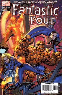
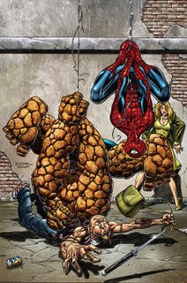
Let's take a look at two images of the Thing, shall we...?


On the left is the cover from Fantastic Four #535, while on the right is the cover to the upcoming Thing #6. Even at this smaller size, you should be able to discern a difference between how the Thing has been colored. In the FF, Ben's coloring makes each of the rocks that make up his hide somewhat three-dimensional. Each rock has it's own highlight and shadow, giving each rock its own depth. In The Thing, though, we see a textured appearance. The individual rocks still get their own attention, with their own light sources, but the rocks aren't nearly as smooth. They've been battered and bashed over the years, and so they are no longer uniform across the surface. The little dings and divets over the surface of each rock shows a series of smaller highlights and shadows, giving a more mottled, or textured, appearance.
Now, is either approach more correct than the other? No, of course not. While you can certainly have an individual preference for one over the other, I'd like to point what I see as a logical (and again, nuanced) reason for the difference. The Thing is centered on one character and, something like Stever Gerber's run on She-Hulk, he's rather isolated from the rest of humanity. The colorist here (Larura Villari, by the way) has chosen to highlight that fact by texturing him in a manner noticeably different than the other characters. Compare her coloring of the Thing against Spider-Man, the thug, and the woman in that image. You'll notice that, of the four of them, Ben is the only one who doesn't have a slick, polished sheen to him. He's rough, textured and stands apart from the norm.
That's the attention to detail that's going into The Thing. That's the level of quality and devotion these folks are putting into it. Personally, I think that's really slick and worthy of our attentions. Personally, I think you ought to pick up the book and have your local shop start pulling it for you every month.


0 comments:
Post a Comment